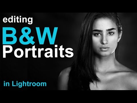
Black and white portrait editing is one of those things that looks simple until you try it. You desaturate, you squint at the screen, and you end up with something that looks like a DMV photo with the color stripped out. Flat, gray, lifeless. The problem isn’t the subject and it usually isn’t the light. It’s that most people stop after clicking the black and white button and call it done.
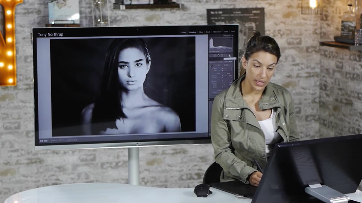
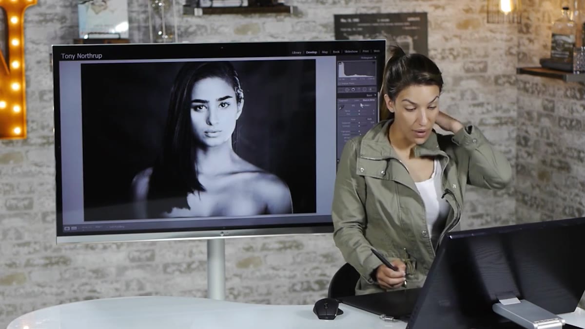
I ran into this constantly when I was first editing press shots for my band. Nobody could afford a photographer, so I became the photographer, the editor, and the guy who had to figure out why every portrait looked like it was shot through a dirty window. It wasn’t until I started studying how working photographers actually handle black and white that things clicked. In this Tony & Chelsea Northrup tutorial, Chelsea walks through a portrait edit that goes from flat gray to genuinely dramatic in a few focused steps. The technique is straightforward, but the thinking behind it is worth unpacking carefully.
Watch the full tutorial on YouTube
Step 1: Retouch in Color First
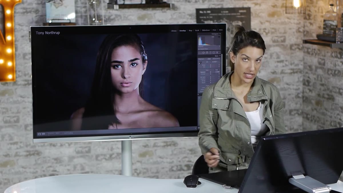 Retouching blemishes on a color portrait in Lightroom
Before you touch the black and white conversion, do your retouching while the image is still in color. Chelsea is explicit about this, and she’s right. Skin tones give you reference points. You can see redness, uneven texture, and blemishes far more clearly against natural skin color than against a gray scale. Heal or clone out anything distracting before you lose that visual context. For most portraits, this is a quick pass. For problem skin, it can take longer, but it always goes faster in color.
Step 2: Convert to Black and White
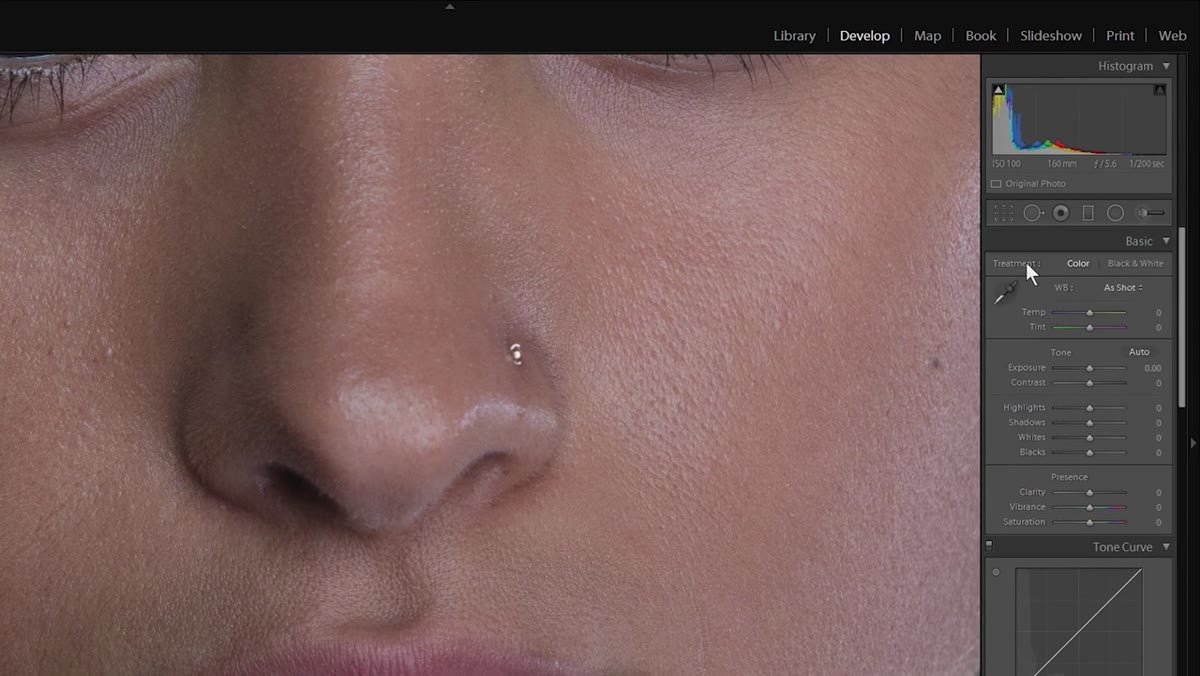 Clicking the Black and White treatment option in the Basic panel
Once retouching is done, go to the Basic panel and switch the Treatment to Black and White. Lightroom applies a default conversion that is almost always too flat. You will immediately see that the highlights are muddy gray instead of clean white, and the shadows lack depth. This is not a failure. It is just the starting point. Resist the urge to call it good or to reach for a preset. The next two steps are where the real work begins.
Step 3: Set Your Whites and Blacks with Clipping Preview
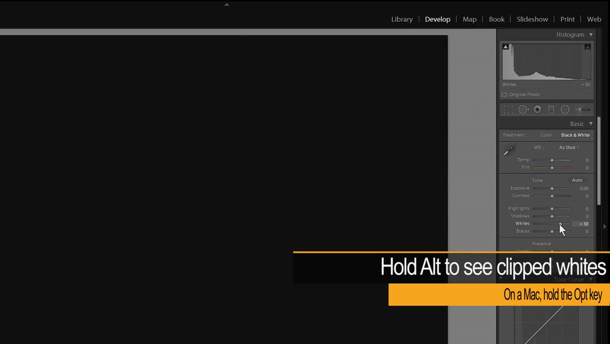 Dragging the Whites slider up with Alt key held, clipping overlay visible
Hold Alt (Option on Mac) and drag the Whites slider to the right. The screen will go black and show you exactly where clipping begins. Bring it up until you just start to see white appearing in the highlights. That is your ceiling. Then do the same with the Blacks slider, dragging left until the darkest areas show true black. Chelsea also nudges Shadows up slightly here to recover detail in areas like hair where everything can collapse into a single dark blob. The goal is a full tonal range, not blown highlights or crushed shadows. Think of it as stretching the histogram to use the full width of the frame.
Step 4: Use the Adjustment Brush to Bring Out Hair Detail
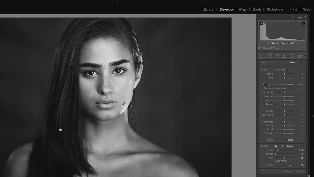
 Painting with Adjustment Brush over dark hair to lift exposure
Even after setting whites and blacks globally, specific areas need local attention. Hair against dark backgrounds is the most common casualty. Chelsea uses the Adjustment Brush with a modest exposure boost to paint over the hair and separate it from the background. The key here is a soft brush with high feathering so the edge of the correction blends and doesn’t look painted on. If it starts to look like a halo, reduce flow and use lighter, overlapping strokes rather than one heavy pass. You want the hair to read as hair, not as a gray smear floating near the subject’s head.
Step 5: Accentuate Highlights for Facial Contouring
 Painting highlight areas on cheekbones, nose bridge, and forehead
This is the step that separates a technically correct black and white from one that actually has dimension. Chelsea uses a new Adjustment Brush set to a mild exposure increase and paints the natural highlight zones of the face. Cheekbones. The bridge and tip of the nose. The center of the forehead. The Cupid’s bow above the lips. The brow bone just above the eyebrows. Her trick for finding these areas is to squint at the screen. When your eyes are half closed, your brain stops reading fine detail and you see the big shapes of light and shadow instead. It sounds odd. It works. Keep the brush large and soft, and keep the exposure boost subtle. Anywhere between 0.15 and 0.35 is usually enough.
Step 6: Deepen the Shadows for Contrast and Structure
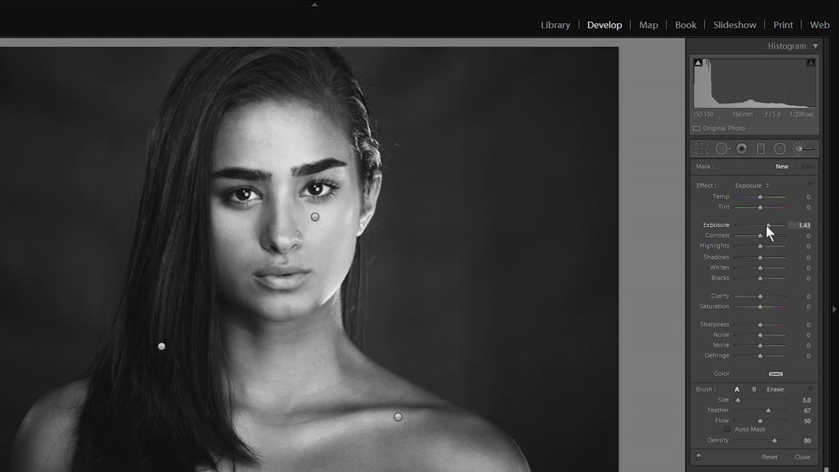 Painting shadow areas alongside the nose and under cheekbones
Create a new Adjustment Brush and dial the exposure down rather than up. Now paint the shadow zones: the sides of the nose, under the cheekbones, the edges of the jaw, any area that naturally recedes. Chelsea makes the point that you could use the global Contrast slider for this, but local shadow control gives you sculpting ability that a single slider never can. You are essentially doing what a painter does with charcoal, deepening the darks to make the lights feel brighter by comparison. Use the same squinting technique to find where the shadows actually fall before you start painting.
Step 7: Refine the Eyes
 Brightening the whites of the eyes and blending with low-flow brush
The eyes anchor everything in a portrait, and in black and white they can easily go gray and lifeless without attention. Chelsea creates a final highlight pass specifically for the eye area, brightening the whites of the eyes and adding a small catchlight pop. She also points out that after all these local adjustments, zoom out periodically and look for transitions that feel abrupt. When a highlight edge meets a shadow edge too sharply, go back into that specific Adjustment Brush, lower the flow to around 20-30 percent, raise feathering, and blend with gentle strokes until the transition looks natural.
What I’d Add: Don’t Skip the B&W Mix Panel
The tutorial doesn’t go deep into the HSL / B&W Mix panel, and that’s worth flagging if you’re editing portraits where specific colors carry important tonal information. Skin tones are built from reds, oranges, and yellows. If your subject’s skin is reading too dark or too light after conversion, dragging the orange and red sliders in the B&W Mix panel gives you a targeted fix without touching anything else. I keep a mental note of the starting colors in every portrait before I convert, so I know which color sliders will have the most impact. It takes ten seconds and saves you from fighting the Exposure slider trying to fix something that isn’t an exposure problem.
The single most important thing Chelsea demonstrates here is that good black and white portrait editing is not a one-move operation. It’s a layered process: get the global tones right, then do local contouring to build dimension, then refine the details. Skipping any of those layers is why so many black and white portraits look like they were desaturated and forgotten.
Watch the full tutorial on YouTube to see Chelsea work through the full edit in real time. Watching the brush strokes in motion makes the contouring logic much easier to internalize than reading about it.
Comments
Leave a Comment