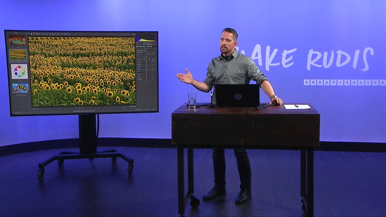
There’s a specific kind of frustration that hits when you’re staring at a cityscape shot at night and you know something looks wrong, but you can’t quite name it. The white balance is off, sure. But which direction? Too warm? Too green? You drag a slider, it gets worse, you drag it back, now you’ve wasted ten minutes and you’re no closer to a fix. That used to be me - especially shooting in mixed artificial light where the camera’s auto white balance essentially throws up its hands. What changed things for me wasn’t a preset or a shortcut. It was actually understanding why a photo looks wrong before touching a single slider.
Watch the full tutorial on YouTube
In this CreativeLive tutorial, photographer Blake Rudis walks through a genuinely clever diagnostic approach to color correction in Adobe Camera Raw and Lightroom - one that’s grounded in color theory rather than trial and error. He uses a Kansas City skyline shot as his primary example, the kind of nighttime cityscape where yellow-orange artificial light turns the whole image into a warm, muddy mess. What he teaches isn’t just how to fix that one photo. It’s a repeatable method for any image where the color feels off and you need to figure out why before you can fix it.
The technique is simple enough to explain in a sentence and deep enough to change how you work: use temporary saturation to amplify whatever color problem exists, identify the culprit color, then apply its complementary color to cancel it out. That’s it. But the execution has real nuance, so here’s the full walkthrough.
Step 1: Open the Image and Resist the Urge to Touch White Balance First
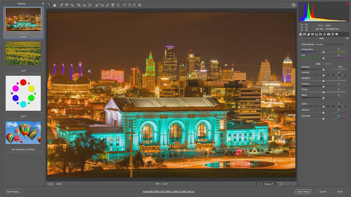 Kansas City skyline with visibly warm color cast open in ACR
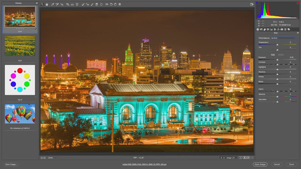
Before you touch the Temperature or Tint sliders, stop. The instinct is to drag Temperature toward blue because the image looks too warm, but without knowing exactly how warm or which warm, you’re just guessing. Open your image in Lightroom or Adobe Camera Raw and look at it with fresh eyes. Notice the general direction of the problem. Warm? Cool? Greenish? Don’t answer yet - you’re about to find out for sure.
Step 2: Slam the Saturation Slider to 100
 Saturation slider pushed to maximum revealing dominant color cast
This is the move that changes everything. Go to the Basic panel and drag Saturation all the way to 100. The image is going to look terrible. That’s the point. What you’re doing is forcing every color in the frame to its loudest possible version, which makes the dominant color problem impossible to miss. On a natural-looking image, this would be overwhelming. On a photo with a color cast, it’s a diagnostic tool. You are not saving this. You are reading the image.
On the Kansas City shot, cranking saturation reveals a heavy presence of yellow and orange. On a subtler image - Rudis also demonstrates this with a sunflower shot - you might see an unexpected greenish-blue tint in areas you thought were neutral. Either way, the saturation boost tells you the name of your problem color.
Step 3: Identify the Dominant Problem Color
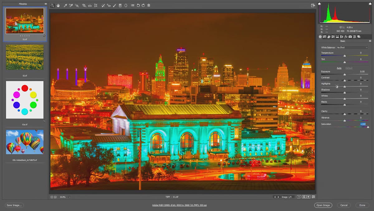 Oversaturated image clearly showing yellow-orange as the dominant cast
Look at what just got louder. If you see yellows and oranges screaming at you, yellow is your culprit. If you see a cold cyan-green taking over the highlights or foliage, that’s your problem. The key insight here is that Lightroom has already done the work of telling you the solution - it’s right there in the Temperature slider’s visual design. The slider goes from blue on one end to yellow on the other. If yellow is too strong, you need blue. If the image is too blue-green, you need yellow-orange. This is complementary color theory applied directly to a tool you already have open.
Step 4: Adjust Temperature Using Its Complementary Color
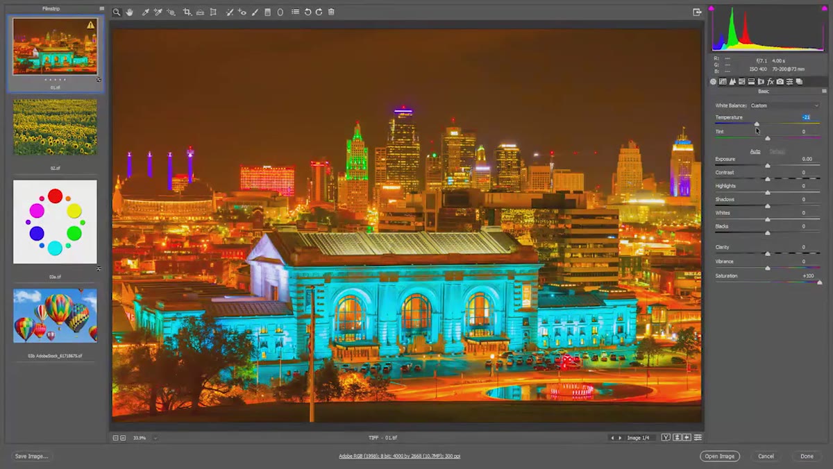 Temperature slider being pulled toward blue to neutralize yellow cast
Now you move with intention. If yellow is the problem, pull the Temperature slider toward the blue end. You’re not cooling the image - you’re neutralizing it. Watch the effect in your oversaturated preview. As you add blue, the aggressive yellow starts to calm down and the image begins to find a more balanced color foundation. The goal here isn’t to make it look right at 100% saturation. The goal is to find the point where no single color is dominating unfairly.
For the cityscape example, pulling toward blue significantly reduces that orange-yellow smear that was making the image look like it was shot through a sodium lamp. For the sunflower image, pushing slightly toward yellow brought the actual sunflowers to life by removing a competing bluish cast that was flattening them.
Step 5: Fine-Tune with the Tint Slider
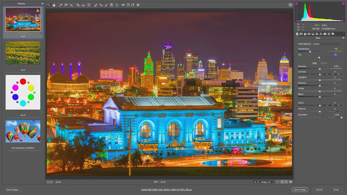 Tint slider adjusted to reduce magenta after temperature correction
Temperature handles the yellow-blue axis. Tint handles the green-magenta axis. After you’ve made your Temperature adjustment, check whether magenta or green has become more obvious in your oversaturated view. On the Kansas City shot, there’s a touch of magenta bleeding in through some of the artificial light sources. A small move toward green on the Tint slider handles that without overcorrecting. These adjustments are usually small. You’re not making dramatic shifts - you’re trimming the remaining imbalance after the main Temperature correction does the heavy lifting.
Step 6: Reset Saturation to Zero and Evaluate
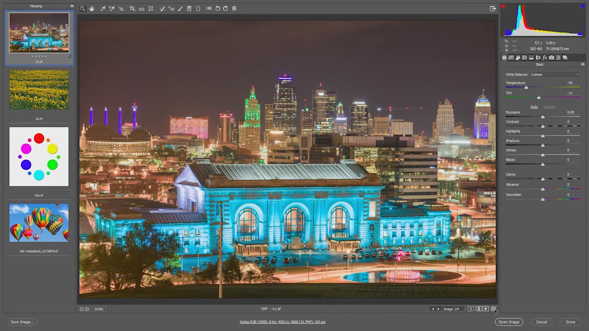 Saturation returned to zero revealing corrected white balance result
Once you’ve dialed in your Temperature and Tint at high saturation, bring Saturation back to zero. The image will look flat - that’s normal, zero saturation removes all color. What you’re checking here is that the underlying tonal foundation is now neutral and correct. Then bring Saturation back to your preferred working value (usually somewhere around 0 to +20 depending on the photo) and evaluate the result against the original. The before-and-after comparison is often subtle on naturally lit images, but that’s exactly the point. Subtle corrections stack. Ten small, correct decisions make one image that looks genuinely polished.
Why I Keep Coming Back to This Method
I’ve tried a lot of approaches to white balance over the years - eyedropper on a gray card, auto white balance in-camera, just dragging sliders until it feels right. The saturation diagnostic is the one that actually trained my eye rather than just solving the immediate problem. After doing it a few hundred times, I started seeing color casts before I boosted saturation. The method taught me the visual vocabulary.
One caveat from my own workflow: this technique works best when you do it before any other adjustments. If you’ve already pushed Exposure or adjusted individual color channels in HSL, the boosted saturation view gets noisy and harder to read. Make it your first move on a fresh raw file and it’s clean and reliable every time.
The single most important thing to take away from this technique is that color correction stops being guesswork the moment you understand complementary colors. Yellow casts need blue. Magenta casts need green. Blue-green casts need yellow. Lightroom’s Temperature and Tint sliders are literally built around these relationships. The saturation boost just makes the problem visible enough to act on with confidence.
Watch the full tutorial on YouTube to see Blake walk through both the cityscape and the sunflower examples in real time - the visual demonstration of the saturation diagnostic is worth seeing once before you try it yourself.
Comments
Leave a Comment