Lightroom Presets: The Creative Shortcut That Actually Works

Lightroom Presets: The Creative Shortcut That Actually Works

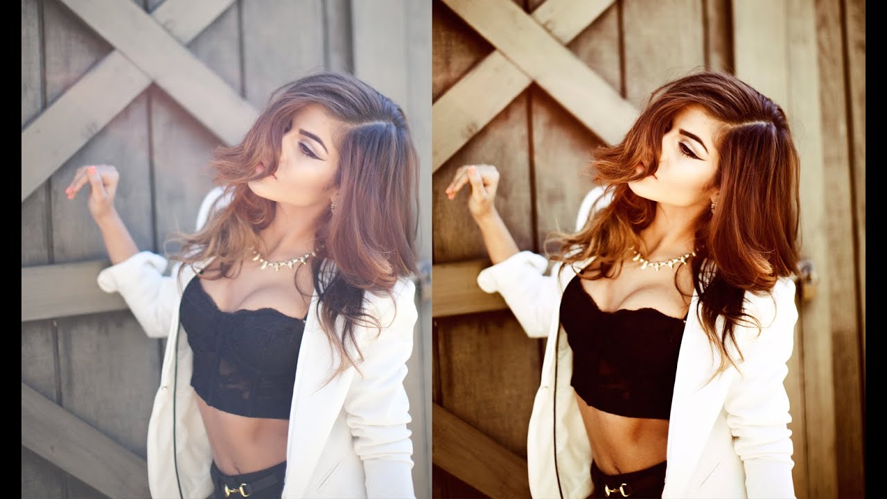
Lightroom Presets: The Creative Shortcut That Actually Works I used to think Lightroom presets were for people who didn’t know how to edit. Then I realized I was being a snob about the wrong thing. Presets aren’t about laziness—they’re about efficiency. They’re the difference between spending three hours editing a wedding shoot and spending three hours actually creating something distinctive. Think of them as your signature font, not a copy-paste button.

Lightroom Mobile: Professional Editing on Your Phone

Lightroom Mobile: Professional Editing on Your Phone

I edited an entire client gallery on Lightroom Mobile during a six-hour flight. The client couldn’t tell the difference from my desktop edits. That’s not a gimmick — Lightroom Mobile is genuinely capable of professional work. Here’s how to get the most from it. What You Get for Free (and What’s Paid) Free tier includes basic editing tools: exposure, contrast, white balance, tone curve, color mixer, effects, detail, and optics. That covers a lot.

Lightroom Masking: The AI-Powered Selection Tools

Lightroom Masking: The AI-Powered Selection Tools

Lightroom’s masking tools have transformed how targeted edits work. What used to require careful brushwork or a trip to Photoshop can now be done with a single click. The AI-powered selections are fast, accurate, and genuinely useful once you understand their strengths and limitations. The AI Selection Tools Select Subject Click “Select Subject” and Lightroom’s AI identifies and masks the primary subject — usually a person, animal, or prominent object. The accuracy is impressive, especially with well-defined subjects against distinct backgrounds.

Kodak's Ektapan Revival: What Film Photographers Need to Know About Editing These Classics

Kodak's Ektapan Revival: What Film Photographers Need to Know About Editing These Classics

Kodak’s Ektapan Revival: What This Means for Your Film Workflow I’ve been watching Kodak’s recent comeback with genuine excitement, and their latest announcement didn’t disappoint. The company just brought back one of their most legendary film stocks—Ektapan—and they’re doing it in a way that actually matters for working photographers. A Legendary Name Returns For those of us who appreciate film’s tactile history, Ektapan is basically the Beatles reunion we didn’t know we needed.

The HSL Panel: The Most Powerful Tool in Lightroom

The HSL Panel: The Most Powerful Tool in Lightroom

Most Lightroom users adjust exposure, contrast, and white balance, then jump straight to presets or export. They skip the HSL panel entirely — and they’re missing the most powerful color control tool in the entire application. HSL stands for Hue, Saturation, and Luminance. It lets you adjust individual color ranges independently, giving you precise control over how every color in your image looks. How HSL Works The HSL panel breaks your image into eight color channels: Red, Orange, Yellow, Green, Aqua, Blue, Purple, and Magenta.

How to Fix Overexposed Photos in Lightroom

How to Fix Overexposed Photos in Lightroom

You review your photos after a shoot and several are overexposed — the sky is white, skin looks washed out, and details have disappeared into blown highlights. Before you delete them, try these recovery techniques. Modern raw files contain far more highlight information than what’s visible at default settings. Step 1: Assess the Damage First, turn on the highlight clipping indicator by pressing J in the Develop module (or clicking the triangle in the top-right corner of the histogram).

How to Edit Photos Like a Professional: Lightroom Mastery in 2024

How to Edit Photos Like a Professional: Lightroom Mastery in 2024

How to Edit Photos Like a Professional: Lightroom Mastery in 2024 I’ve been editing photos for over a decade, and I can tell you with absolute certainty: the difference between amateur and professional editing isn’t about expensive gear or secret filters. It’s about understanding fundamental principles and applying them with intention. If you want to know how to edit photos like a professional, you’re in the right place. Think of professional editing like the difference between a home-cooked meal and a Michelin-star restaurant dish.

How to Edit Photos for Instagram Consistently

How to Edit Photos for Instagram Consistently

The Instagram feeds that attract followers and feel professional have one thing in common: visual consistency. Not every photo looks identical, but they share a cohesive feeling — a consistent color palette, similar tonal range, and recognizable processing style. Here’s how to develop and maintain that consistency. Define Your Style First Before touching any editing tools, look at your best 20 photos and identify what they have in common. Ask yourself:

How to Calibrate Your Monitor for Accurate Color

How to Calibrate Your Monitor for Accurate Color

If your monitor isn’t calibrated, every color decision you make while editing is based on inaccurate information. You might think your image has perfect white balance, but someone viewing it on a calibrated screen sees an orange cast. Your careful color grade might look completely different on a client’s display. Calibration brings your monitor to a known, accurate state. It’s not optional for anyone serious about photography or design. Why Monitors Need Calibration Every monitor displays color differently out of the box.

How Ryan Gosling's Alien La La Land Remake Proves Color Grading Makes the Character

How Ryan Gosling's Alien La La Land Remake Proves Color Grading Makes the Character

When a Simple Character Swap Changes Everything Ryan Gosling just pulled off something hilarious and unexpectedly brilliant—he recreated the iconic La La Land poster, but with a twist that made me stop and think about the fundamentals of visual storytelling. Instead of Emma Stone as his co-star, there’s now an alien. And somehow, it works. I know what you’re thinking: “That sounds ridiculous.” You’re right. But here’s what fascinated me about this swap—it’s actually a masterclass in how much color grading influences our emotional connection to an image.

How Indie Game Aesthetics Are Reshaping Color Grading in 2024

How Indie Game Aesthetics Are Reshaping Color Grading in 2024

How Indie Game Aesthetics Are Reshaping Color Grading in 2024 I’ve been noticing something fascinating lately while scrolling through this season’s indie game announcements: the visual language of independent developers is becoming increasingly sophisticated, and honestly? It’s a masterclass in intentional color grading. The Indie Game Visual Revolution The indie gaming scene right now is absolutely thriving, with developers pushing creative boundaries in ways the AAA studios sometimes struggle to match.

From Film School to the Final Frontier: The Visual Journey of NASA's Lunar Explorers

From Film School to the Final Frontier: The Visual Journey of NASA's Lunar Explorers

From Film School to the Final Frontier: The Visual Journey of NASA’s Lunar Explorers There’s something beautifully poetic about the fact that some of humanity’s most important space explorers cut their teeth at National Geographic’s film school. This April, Commander Reid Wiseman, Pilot Victor Glover, Mission Specialist Christina Koch, and Canadian astronaut Jeremy Hansen will make history aboard NASA’s Artemis II mission—and they’re bringing that documentary-trained eye with them. The Documentary Sensibility in Space When you’ve studied under the mentorship of Nat Geo’s visual storytellers, you understand something fundamental: every frame matters.