Virtual Copies in Lightroom: One Photo, Three Versions, Zero Extra Storage

Virtual Copies in Lightroom: One Photo, Three Versions, Zero Extra Storage

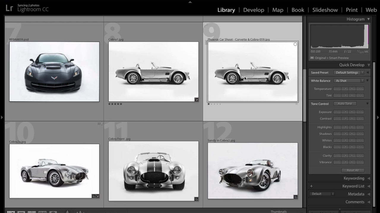
There’s a specific kind of dread that hits when a client asks for “a few different looks” on 200 wedding photos. Your first instinct is to duplicate everything, which means double the storage, double the catalog clutter, and double the time spent organizing files you didn’t need in triplicate. For years, I handled this the hard way before I understood what virtual copies could actually do for a portrait and event workflow.

Lightroom Color Editing Finally Makes Sense — Here's the Tool You're Probably Ignoring

Lightroom Color Editing Finally Makes Sense — Here's the Tool You're Probably Ignoring

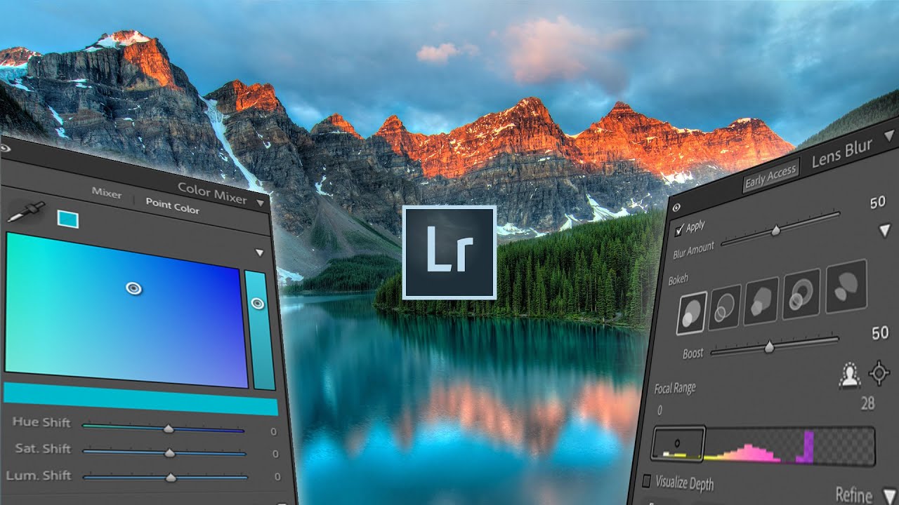
Color questions are the ones that fill my inbox. Not exposure, not sharpening, not even masking. Color. People want to know why their images look muddy, why the greens feel fake, why the sky went from moody to neon the second they touched the saturation slider. I spent years answering those questions one reply at a time before I realized the real problem: most photographers learn color tools in isolation, without ever understanding how each one interacts with the others.

There's a Hidden Vibrance Brush in Lightroom (And It's Been There the Whole Time)

There's a Hidden Vibrance Brush in Lightroom (And It's Been There the Whole Time)

I’ve been editing photos in Lightroom long enough to think I’d found all the tricks. And then something comes along and completely rearranges my mental model of how a tool works. That happened recently when I watched a tutorial by Matt Kloskowski showing a vibrance adjustment hidden inside Lightroom’s local adjustment tools. Not a workaround. Not a hack. A legitimately different rendering behavior that’s been sitting there quietly the whole time.

The Lightroom Setting I Ignored for Years (And Why That Was a Mistake)

The Lightroom Setting I Ignored for Years (And Why That Was a Mistake)

For the longest time, I treated the Profile field in Lightroom’s Basic panel like the terms and conditions on a software update. I knew it was there. I scrolled past it every single time. My photos came out fine, my clients were happy, and I told myself the default was good enough. Then I started digging into how other editors actually approach the beginning of their workflow, and I realized I had been skipping one of the most powerful starting points in the entire develop module.

How I Edit 200 Photos in 20 Minutes Using Lightroom's Batch Tools (Without Making Them All Look the Same)

How I Edit 200 Photos in 20 Minutes Using Lightroom's Batch Tools (Without Making Them All Look the Same)

Last spring I had a client deliver 340 RAW files from a single-day brand shoot. Same location, same subject, same lighting rig from 9am to 3pm. On paper, that sounds like a batch editor’s dream. Uniform conditions, predictable exposures, clean white balance. I figured I’d be done by dinner. I was done by midnight, and not because I was being precious about each frame. I was done at midnight because I kept chasing inconsistencies I created myself by applying the same global edits to shots that, despite looking identical at a glance, had subtly different exposure values, different distances from the strobe, and different amounts of ambient window light creeping in as the afternoon wore on.

From Flat RAW to Cinematic: How Pierre T. Lambert's Lightroom Workflow Actually Works

From Flat RAW to Cinematic: How Pierre T. Lambert's Lightroom Workflow Actually Works

There’s a particular kind of frustration that hits when you open a RAW file and it looks absolutely nothing like what you saw through the viewfinder. Flat, muddy, lifeless. I’ve been editing photos long enough to know that the gap between the RAW capture and the finished image is where most photographers either give up or develop a real workflow. For a long time, my own workflow was a patchwork of habits I’d picked up from a dozen different sources, none of them quite fitting together.

The Adjustment Brush Shortcut That Saves Me From Toggling Auto Mask Every 30 Seconds

The Adjustment Brush Shortcut That Saves Me From Toggling Auto Mask Every 30 Seconds

There’s a specific kind of editing frustration that I’ve felt probably a thousand times. You’re painting a local adjustment across a large area of a photo, moving fast, and then you hit an edge. Maybe it’s the rim of a coffee cup, the shoulder of a jacket, a hard line between sky and building. Suddenly you have two bad options: slow everything down by turning on Auto Mask and deal with the lag, or keep painting fast and accept that you’ll bleed color or exposure onto something you didn’t want to touch.

How to Edit Dark and Moody Photos in Lightroom: A Step-by-Step Breakdown

How to Edit Dark and Moody Photos in Lightroom: A Step-by-Step Breakdown

There’s a specific kind of photo that stops your scroll. Dark, atmospheric, a little desaturated, like it was found in a shoebox in someone’s attic. It doesn’t look over-processed. It looks like it has a past. Getting there in Lightroom is less about applying one magic slider and more about understanding a chain of decisions that each build on the last. I’ve been chasing that look for years, and Watch the full tutorial on YouTube from photographer Jessica Kobeissi is one of the cleaner, more honest breakdowns I’ve seen of the process.

Why Your Exported Photos Look Nothing Like They Did in Lightroom (And How to Fix It)

Why Your Exported Photos Look Nothing Like They Did in Lightroom (And How to Fix It)

I used to send edited photos to clients and then immediately text them to ask if the files looked okay. Not because I was being thorough. Because I genuinely wasn’t sure what they were going to see on their end. The colors I’d spent an hour coaxing into something cinematic would land in their inbox looking flat, oversaturated, or weirdly greenish depending on what device they opened them on. It was embarrassing, and for a while I thought I was just bad at editing.

Two Lightroom Moves That Made Scott Kelby's Greece Photos Look That Good

Two Lightroom Moves That Made Scott Kelby's Greece Photos Look That Good

There’s a specific kind of frustration I know well: you shoot in a genuinely beautiful location, the light is doing everything right, and then you open the RAW files and they look like a photocopy of what you actually saw. Flat. Gray. Like the camera just gave up. For years, my fix was to spend 45 minutes per image throwing sliders around until something clicked. It worked, but it wasn’t a workflow.

How to Move Your Lightroom Catalog to a New Computer Without Losing Your Mind

How to Move Your Lightroom Catalog to a New Computer Without Losing Your Mind

Every few years, a new computer shows up and suddenly you’re staring at a migration project you were not mentally prepared for. I’ve been there. New laptop arrives, old one needs to go, and somewhere in the middle is your entire Lightroom catalog with years of edits, collections, and presets that you absolutely cannot afford to lose or rebuild from scratch. The process is not complicated once you understand what Lightroom actually is doing under the hood, but if you go in blind, you will end up with a library full of question marks and a very bad afternoon.

Stop Guessing at Print Settings: Lightroom Export for Prints That Actually Match Your Screen

Stop Guessing at Print Settings: Lightroom Export for Prints That Actually Match Your Screen

Printing your own work should feel like a reward. You spent hours getting the edit right, the colors are dialed in, the tones sit exactly where you want them. Then the print comes back and it looks like it was processed in a different decade. I used to think this was just the cost of printing, something you accepted like buffering on a slow internet connection. Turns out, it’s almost entirely a workflow problem, and it’s fixable.