Split Toning in Lightroom: The Secret Weapon for Cinematic Color Grading

Split Toning in Lightroom: The Secret Weapon for Cinematic Color Grading

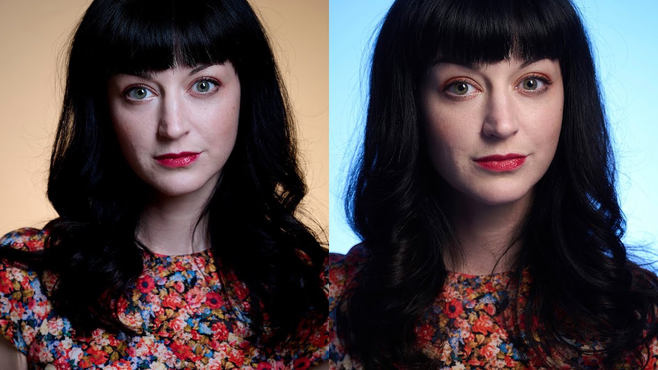
Split Toning in Lightroom: The Secret Weapon for Cinematic Color Grading I used to think my photos were missing something intangible—that ineffable quality that separates “nice Instagram photo” from “I want to frame this.” Then I discovered split toning, and honestly, it changed everything. Split toning is when you add different colors to the shadows and highlights of an image simultaneously. It’s the technique behind those moody, cinematic edits you see in prestige TV shows and indie films.

Split Toning: Adding Mood with Color Contrast

Split Toning: Adding Mood with Color Contrast

Split toning adds different color tints to the shadows and highlights of an image. It’s one of the most powerful mood-setting tools in Lightroom, and it works on both color and black and white images. The principle is simple: warm highlights and cool shadows (or vice versa) create a color contrast that adds dimension and atmosphere to any image. Understanding the Color Grading Panel Lightroom’s Color Grading panel (formerly called Split Toning) gives you three color wheels:

Moody Edits: Achieving Dark and Atmospheric Looks

Moody Edits: Achieving Dark and Atmospheric Looks

Moody editing gets a bad reputation because it’s easy to do poorly. Crank down the exposure, add a blue tint, call it moody. That’s not mood — that’s just a dark, muddy photo. Real moody editing creates atmosphere and emotion through deliberate tonal and color choices. Here’s how to do it with intention. The Moody Mindset Before touching any sliders, understand what mood you want to create. “Moody” isn’t one look — it’s a spectrum:

Mobile Editing with Lightroom: Professional Results in Your Pocket

Mobile Editing with Lightroom: Professional Results in Your Pocket

Mobile Editing with Lightroom: Professional Results in Your Pocket I’ll be honest—when I first started shooting, the idea of serious editing on my phone felt like asking a chef to prepare a five-course meal in a shoebox. But after spending the last few years pushing Lightroom’s mobile app to its limits, I’ve completely changed my tune. Mobile editing isn’t a compromise anymore. It’s a legitimate, powerful workflow that can produce results that rival desktop editing.

Mobile Editing in Lightroom: Why You're Leaving Photos Behind

Mobile Editing in Lightroom: Why You're Leaving Photos Behind

Mobile Editing in Lightroom: Why You’re Leaving Photos Behind I used to be that photographer who treated mobile editing like a necessary evil—a way to quickly slap a filter on Instagram stories and call it a day. Then I actually committed to learning Lightroom Mobile, and I realized I’d been gatekeeping myself from some seriously powerful workflow possibilities. Here’s the truth: mobile editing isn’t a downgraded version of desktop Lightroom. It’s a different beast entirely, and when you learn to use it properly, you’ll wonder why you ever waited to get home to edit half your shots.

Mobile Editing in Lightroom: Why Your Phone Is Now Your Secret Weapon

Mobile Editing in Lightroom: Why Your Phone Is Now Your Secret Weapon

Mobile Editing in Lightroom: Why Your Phone Is Now Your Secret Weapon I used to be a purist about photo editing. Desktop only. Calibrated monitor. The whole setup. Then I realized I was spending half my time commuting, waiting in coffee shops, and sitting in airports—basically anywhere except in front of my computer—while a backlog of unedited photos piled up on my hard drive like clothes on a chair. Everything changed when I stopped treating Lightroom Mobile as a compromise and started treating it as a legitimate editing powerhouse.

Mobile Editing in Lightroom: The Creative Workflow You've Been Missing

Mobile Editing in Lightroom: The Creative Workflow You've Been Missing

Mobile Editing in Lightroom: The Creative Workflow You’ve Been Missing I spent three years thinking mobile editing was a gimmick—something you’d do when you forgot your laptop on a coffee run. Then I shot a wedding at a destination resort and had six hours between the ceremony and reception to deliver sneak peeks. That’s when everything changed. Lightroom’s mobile app isn’t a watered-down cousin of the desktop version. It’s a legitimate creative tool that I now use for 40% of my color grading work.

Mobile Editing in Lightroom: Professional Results from Your Phone

Mobile Editing in Lightroom: Professional Results from Your Phone

Mobile Editing in Lightroom: Professional Results from Your Phone I used to be that photographer who refused to edit on anything smaller than a 27-inch monitor. The idea of color grading on a phone felt like trying to master the guitar with a ukulele—technically possible, but why would you? Then I spent three weeks traveling through Iceland, armed only with my iPhone and Lightroom Mobile, and I completely changed my mind.

Mastering Tone Curve in Lightroom: The Secret Weapon for Professional Color Grading

Mastering Tone Curve in Lightroom: The Secret Weapon for Professional Color Grading

Mastering Tone Curve in Lightroom: The Secret Weapon for Professional Color Grading When I first discovered the tone curve in Lightroom, it felt like unlocking a cheat code. The basic sliders—exposure, contrast, highlights—they’re great for quick fixes. But the tone curve? That’s where the magic happens. It’s the difference between a decent photo and one that makes people stop scrolling. Think of the tone curve as your personal lighting director. While exposure adjustments are like turning a dimmer switch on and off, the tone curve lets you reshape the entire tonal landscape of your image with surgical precision.

Mastering the Tone Curve in Lightroom: Your Secret Weapon for Professional Color Grading

Mastering the Tone Curve in Lightroom: Your Secret Weapon for Professional Color Grading

Mastering the Tone Curve in Lightroom: Your Secret Weapon for Professional Color Grading When I first started editing photos seriously, I lived and died by the Exposure slider. More light? Turn it up. Too dark? Crank it higher. It worked, sure—but it felt like using a sledgehammer when I needed a scalpel. Then I discovered the tone curve, and everything changed. The tone curve is where amateurs become professionals. It’s the difference between a photo that looks “edited” and one that looks intentional.

Mastering the Tone Curve in Lightroom: Transform Your Photos Like a Pro

Mastering the Tone Curve in Lightroom: Transform Your Photos Like a Pro

Mastering the Tone Curve in Lightroom: Transform Your Photos Like a Pro When I first opened Lightroom’s tone curve panel, I felt like I’d unlocked the cheat code to professional-looking edits. While the Basic panel handles the heavy lifting, the tone curve is where the magic happens. Think of it as the difference between a solid Marvel movie and one that actually wins awards—same foundation, infinitely more refinement. What Is a Tone Curve, Actually?

Mastering the Tone Curve in Lightroom: Transform Your Images with Precision

Mastering the Tone Curve in Lightroom: Transform Your Images with Precision

Mastering the Tone Curve in Lightroom: Transform Your Images with Precision I’ll be honest—when I first opened Lightroom’s tone curve panel, I felt like I was staring at a financial spreadsheet. Lines. Graphs. Numbers. Not exactly inspiring. But then I realized something: the tone curve isn’t complicated at all. It’s actually the most intuitive way to control your image’s mood, contrast, and personality. Think of the tone curve as a control panel for every brightness level in your photo.